In 2019, Sean Martens purchased Bodyfit, a Fitness Centre in Downtown Swift Current. He has a great vision for what it can become, and it starts with bringing the gym back up to the standard the clients expect.
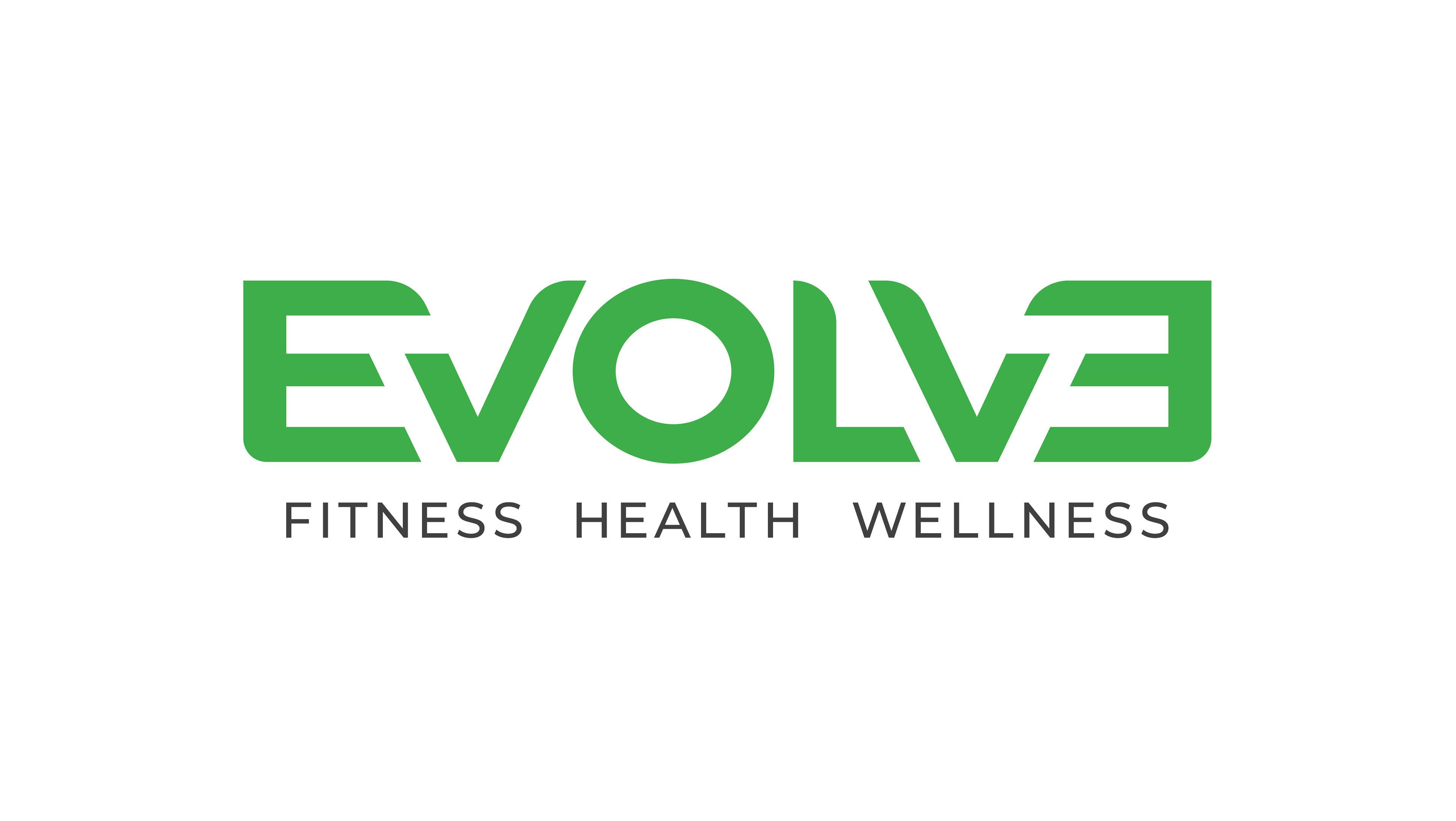
After sitting down with Sean in our initial meeting, I was pretty sure we were on the same wavelength for building a brand. I brought him some sketches later on, and after that, went to work on something more refined. What came out of the process relatively soon was what would ultimately become Evolve Fitness's new logo. We had, in fact, been on the same wavelength for vision, and that has now continued on to his print materials.
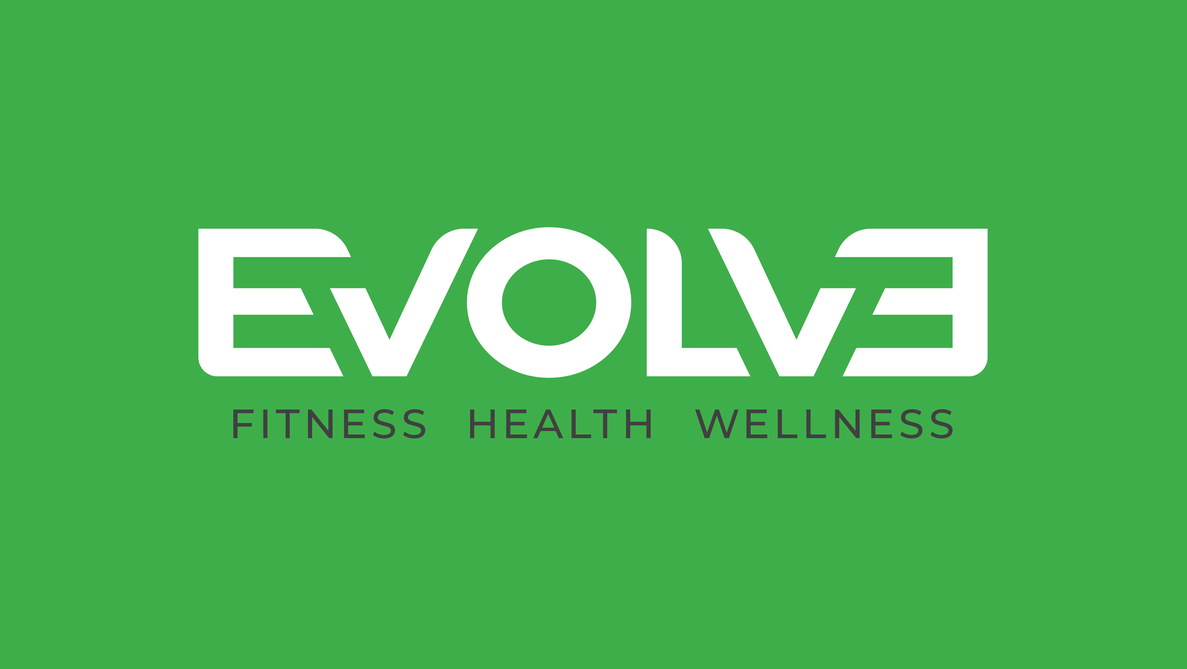
The Evolve logo is a custom designed wordmark. The letters are strong and solid to represent fitness, and look organic to represent health and wellness because of the curved edges and colour. The mirrored E was one of Sean's early ideas that ended up playing perfectly into designing a symmetrical, strong, organic logo. Later on I discovered that we'd also be able to do the same with the V, solidifying a visually strong and symmetrical design.
If you are in search of a fitness centre that caters to more than fitness, including tanning beds and child care, check out Evolve:
https://www.facebook.com/evolvefitnesssc
https://www.facebook.com/evolvefitnesssc