Kim Pridmore lives in Consul, SK and has a side-hustle; laser hair removal services that travels to different small towns in the Southwest. Her service is valuable, as many of the places she visits don't have these services, and many of her clients aren't willing to travel to a larger center for them.
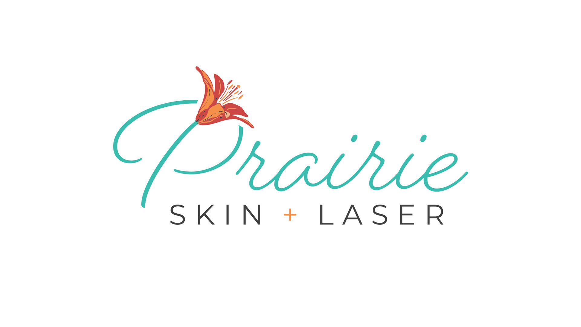
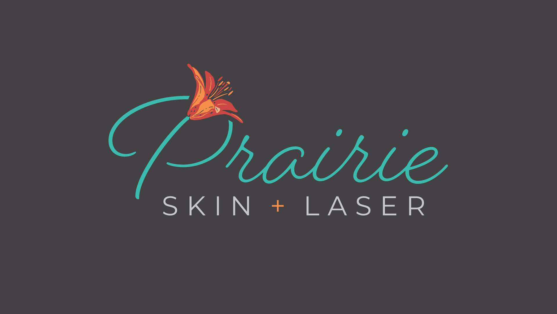
Prairie Skin + Laser's target market is mainly practical, hard-working rural women; often in their 50's and 60's. Because of the connection to a rural lifestyle, we wanted to design something that is beautiful, while still being authentic and real. Nothing too ritzy or posh.
As Kim travels Southwest Saskatchewan, using the province's flower, the Western Red Prairie Lily made a lot of sense. On top of that, it is something beautiful, but not flawless. It is real, like her clients.
An emotional connection for me to this logo is in the story behind the lily icon. My friend, Sammy Khalife had just had surgery to have an LVAD inserted into his heart. This means his heart no longer works, and the LVAD pumps the blood through his body. On top of that, he suffered a stroke during the procedure. While I was in Edmonton visiting him shortly after the surgery, he had a breathing tube in his throat and wasn't really able to do anything. While he would nap, I would work on this lily. I love the way that it turned out.
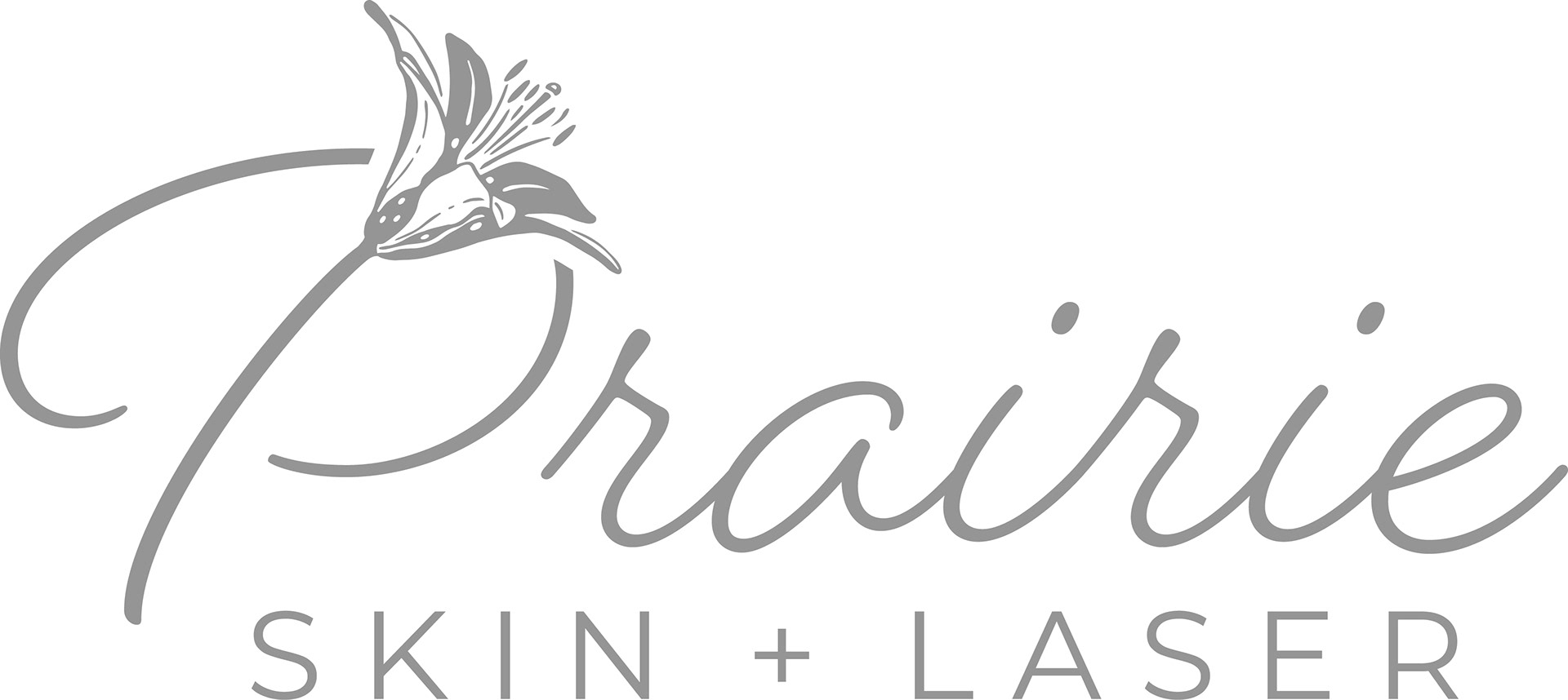
I really fancy simple black and white version of the icon, which is why I've used it on the website.
If you live in the rural Southwest and are interested in Prairie Skin + Laser, check Kim and her dates and locations out here: