'The Research Station', as many locals know it, is actually called the 'Swift Current Research and Development Center'. Did you know it belongs to the federal government? Agriculture and Agri-Food Canada. French on everything too. Pretty big deal, right?
So imagine my surprise when I get an inquiry about designing for them. Here I am amending and signing contracts that have Agriculture and Agri-Food Canada next to the Canada flag at the top of the page. Not intimidating at all...I would tell myself; basically lying.
They wanted an icon and a wall mural. We had discussed additional projects, but COVID-19 ended up getting in the way of the rest.
ICON:
We went through many different concepts for their icon. Some great, some alright, and a couple dark horses. Late in the game, I came up with a new concept that I considered a dark horse. It wasn't my top choice, but it was close, and I had a feeling it might be the 'right option'. (Note: Sometimes your favourite isn't always what is right.)
The concepts got narrowed down to three, and the dark horse was still in it. Sure enough, I got an email that they had chosen it. I couldn't believe it, and at the same time, I could 100% believe it...it sort of just seemed right.
This 'flag icon' is inspired by the landscape of Saskatchewan, with a little shout out to the Saskatchewan flag in there by having a 'green field' above a 'gold field'. It is essentially a minimalist version of a Saskatchewan agricultural landscape, put onto a waving flag. A waving flag can symbolize success and triumph, which is seen in the SCRDC's work. The SCRDC does research with each aspect represented; water, weather, crops etc. and soil.
The breadth of the SCRDC's work is too vast to capture in an icon. It can't be wheat, because they also deal with other grains, but don't forget livestock! But it can't be cattle because they research soil too, and hey, we already forgot about grain ;P Not to mention their other areas of work and research. So by keeping the icon broad and emblematic, we avoid highlighting one or two areas of their work while neglecting others. A wise direction from their staff.
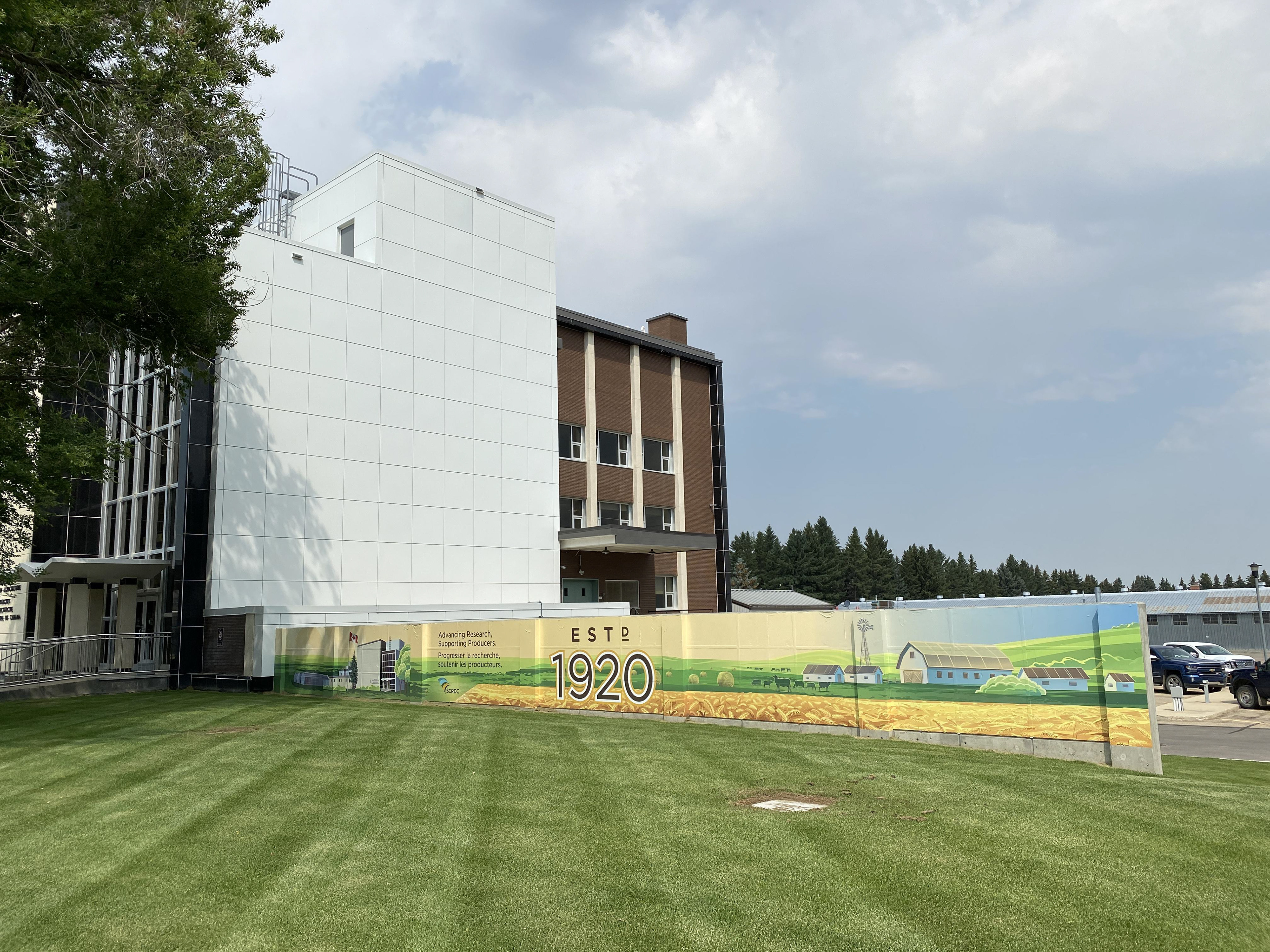
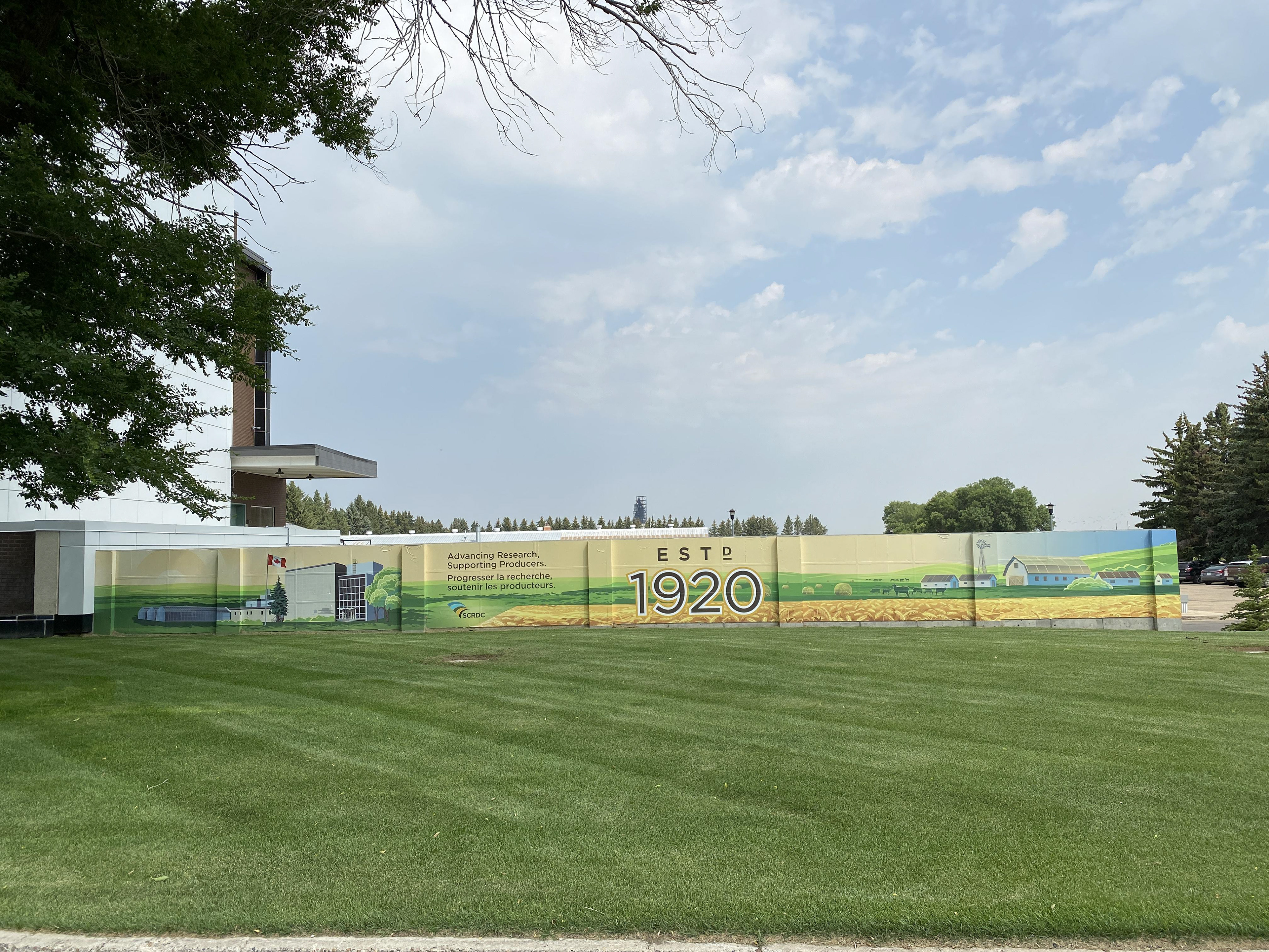
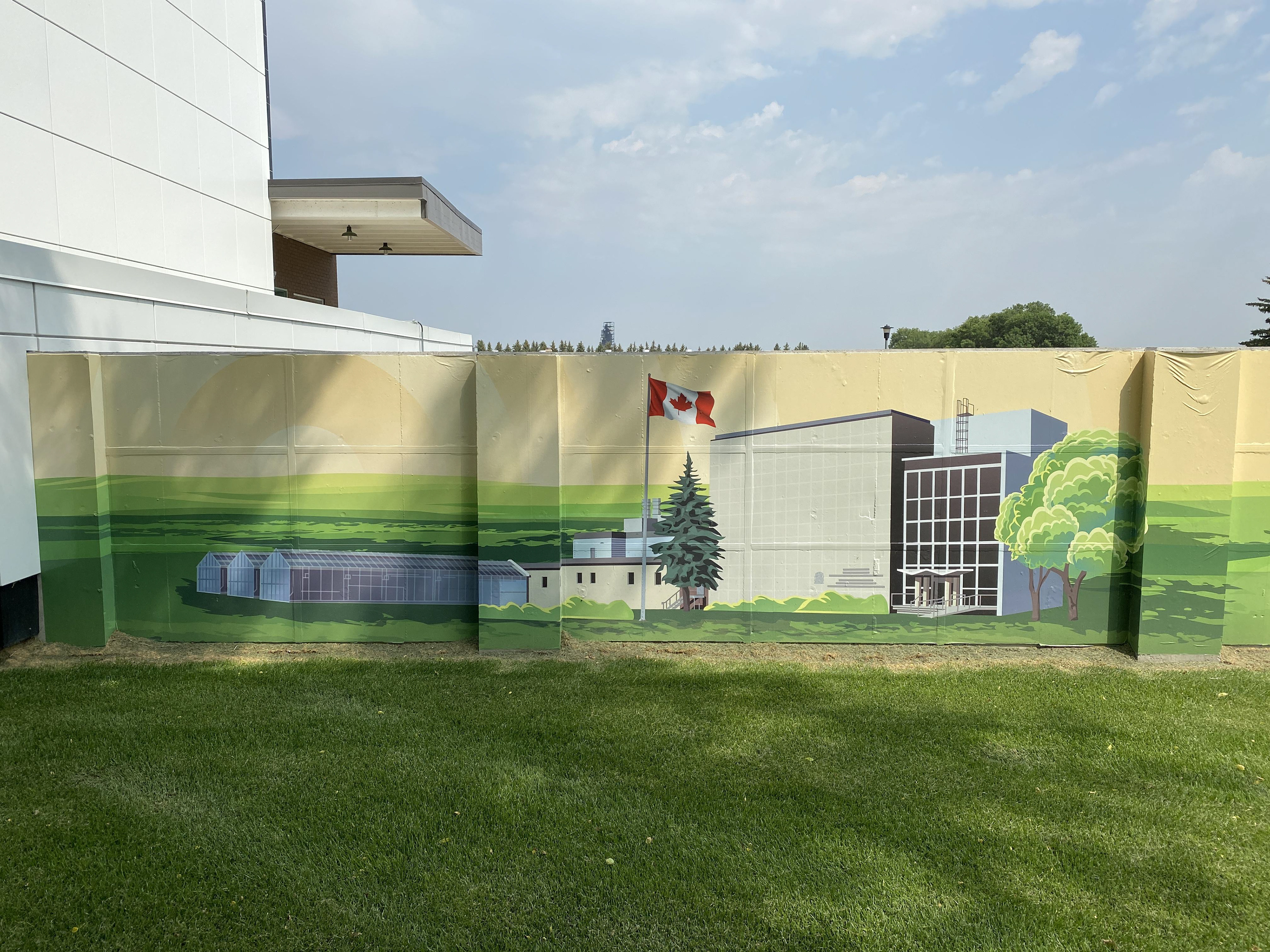
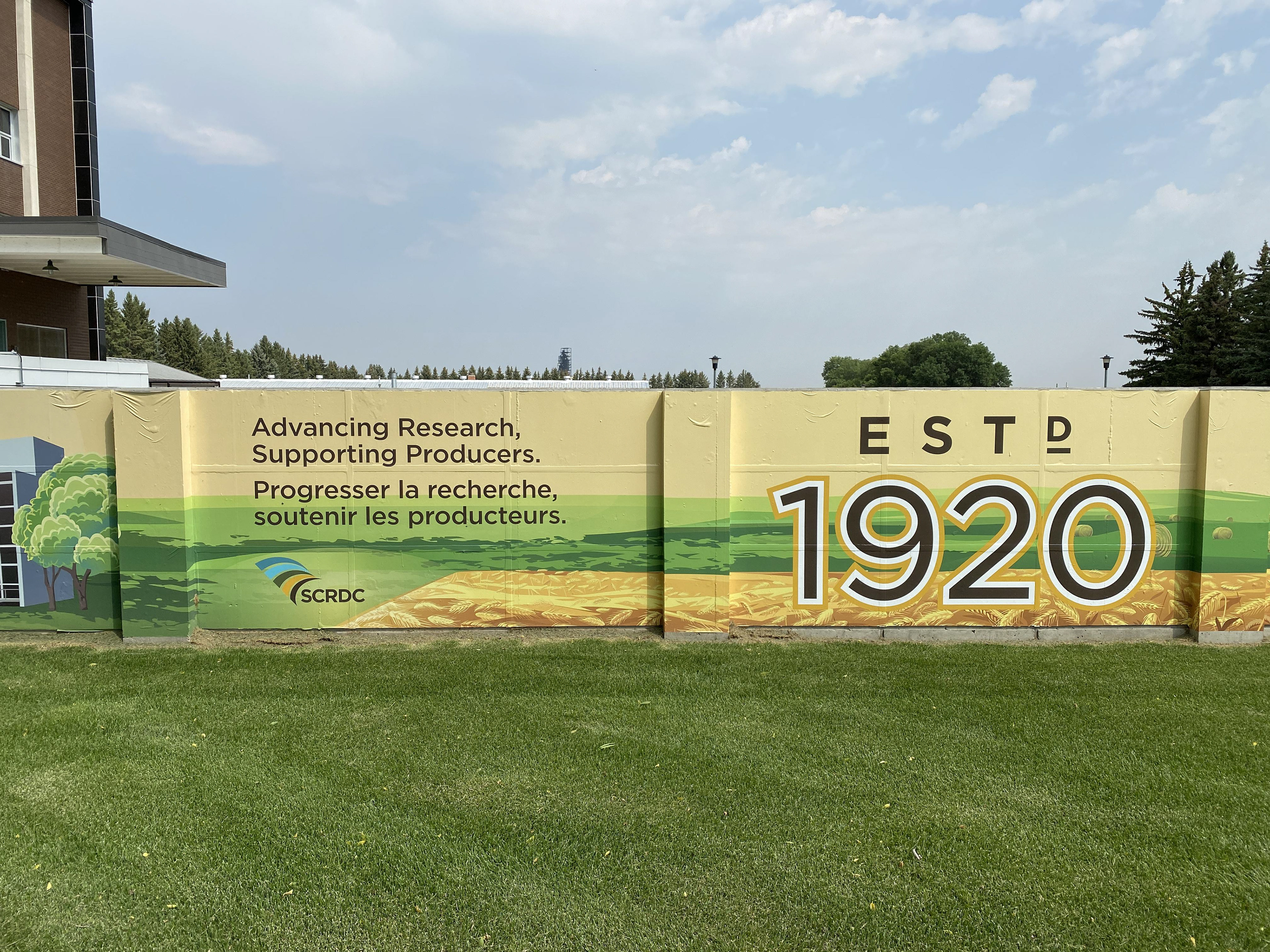
MURAL:
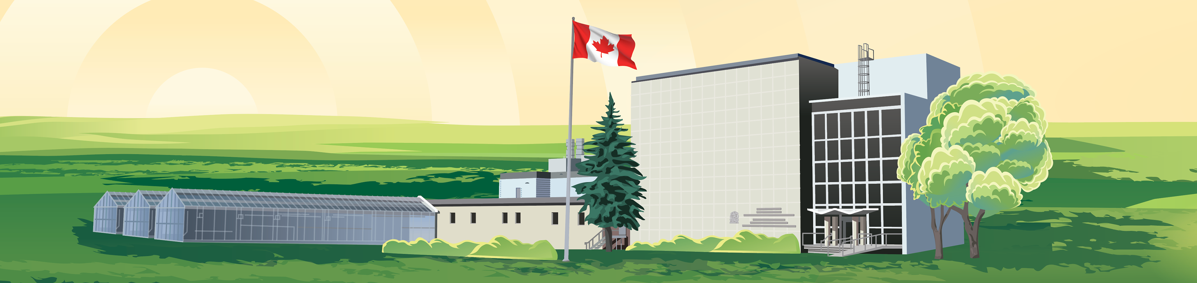
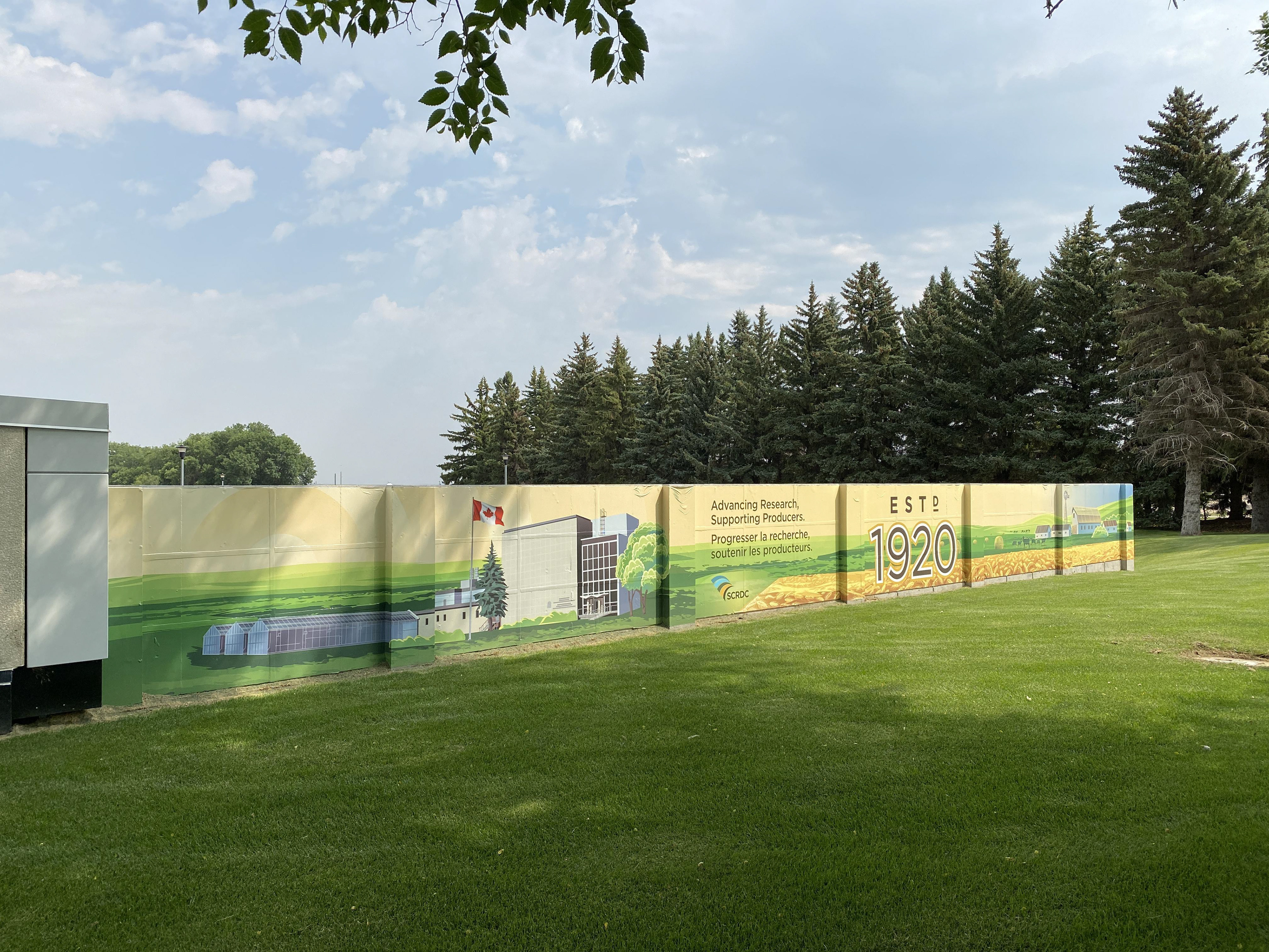
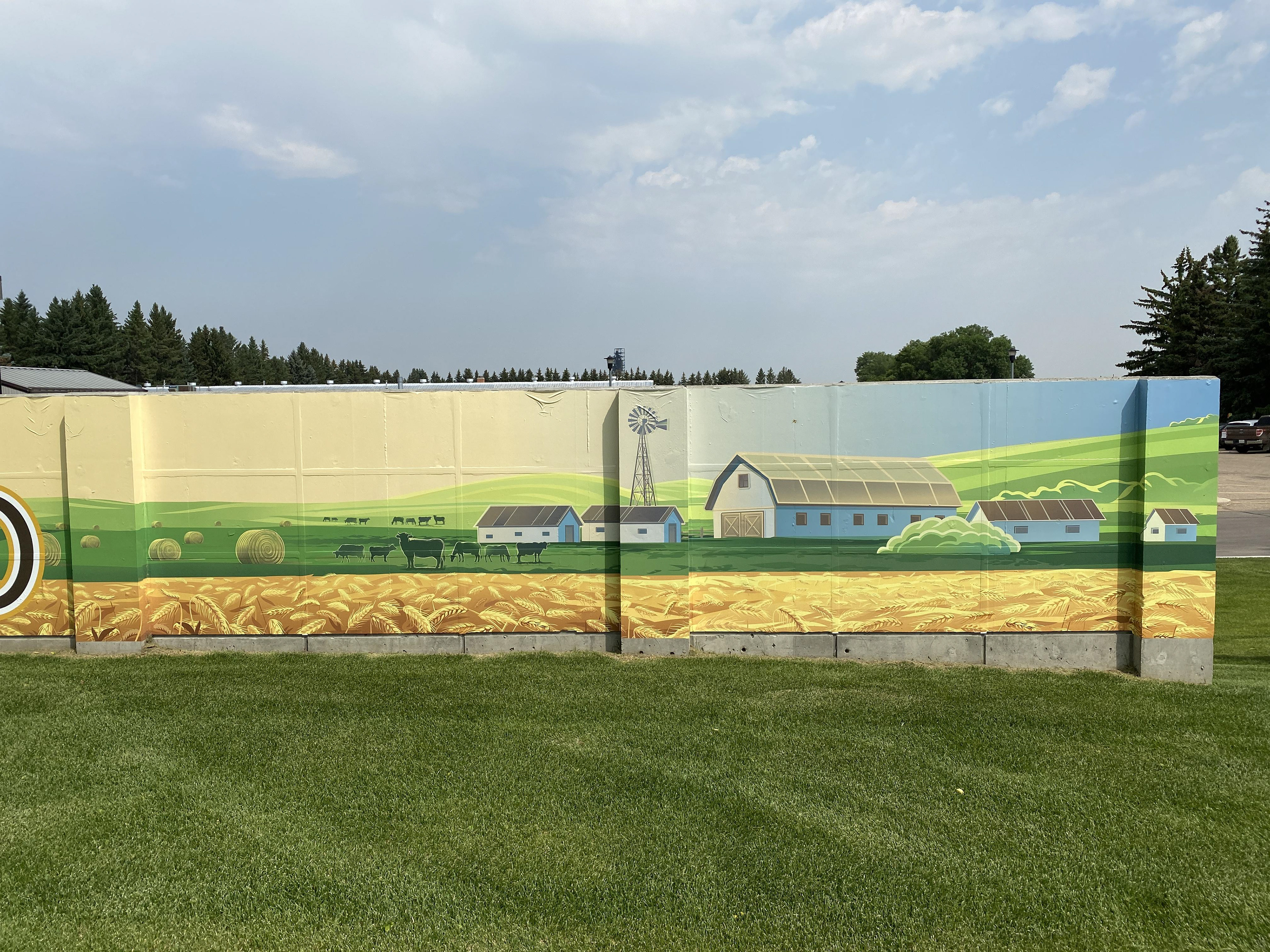
The wall mural might be the physically largest piece of my design work ever produced; if you don't count massive digital billboards near the Calgary airport.
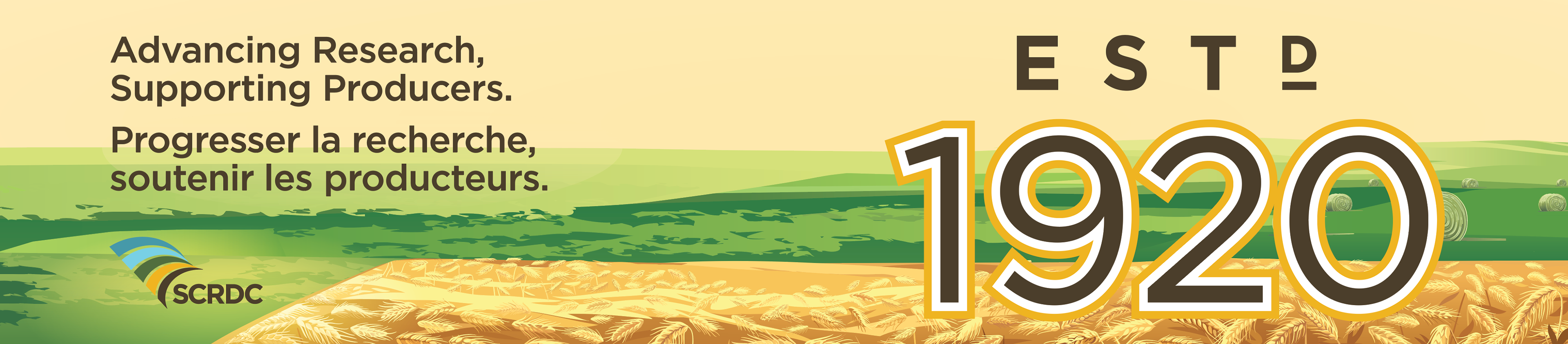
I love this mural. I love the feel, I love the meaning, and I love what it celebrates. 100 years!
I believe that murals are largely about feel. Most folks don't stand and analyze a mural for 5 minutes. Most people walk by it, get a feel, and move on. I wanted it to feel good, calm, successful, and happy. The meaning behind it is the underlying story of how the Research Center provides new technologies and benefits to real farmers doing real work, who provide for the world, year after year. 'Advancing Research, Supporting Producers.' The sun is setting on another day, another year, knowing there is always more work to be done.
Using Estd. 1920 instead of '100 Years' allows the design to live much longer without feeling like it is outdated. No having to explain that 'we celebrated 100 years...5 years ago'; only a celebration of longevity.
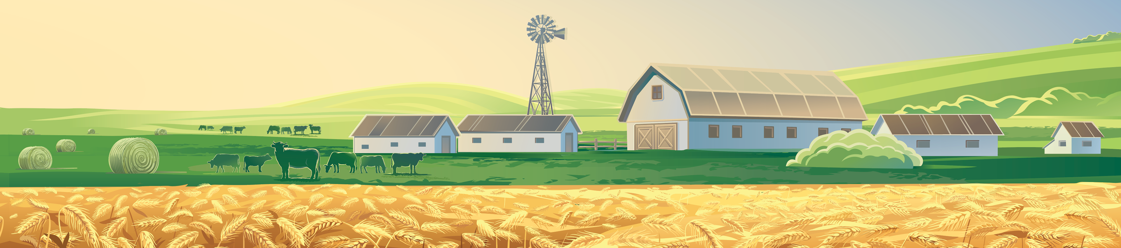
Oh, and yes! I made that Research Center in the mural from SCRATCH! They provided me with some photos, and I made a detailed vector version of the whole thing. It certainly took awhile, but it's quite awesome. The rest of the mural is a purchased stock vector that I then customized and modified.
If you'd like to see the mural, go take a drive past the SCRDC on Airport Road in Swift Current. Turn East off of the #4 Highway just a few seconds South of the train tracks (between the iPlex and leaving town South).
The SCRDC do a very robust amount of work, research, testing, etc. and the end results benefit agricultural producers.
Here's a federal government page for the SCRDC if you'd like to learn more about this fascinating piece of Swift Current, that quite frankly, I think should be much more well known, celebrated, and engraved in our local culture:
#TheMoreYouKnow