2021 marked the 100th year of Stark & Marsh's existence. I find it incredible that some of the businesses in our community are only about 15 years younger than the province is. (SK was established in 1905). That is incredible and a huge testament to their business, their reputation, and how they treat the community. Maybe when I'm 100 years old, I'll understand just how impressive this truly is.
Ashley at Stark and Marsh has been one of the very best clients I've ever worked with, if not the best. She's a true professional. It's always a pleasure to design for Stark and Marsh.
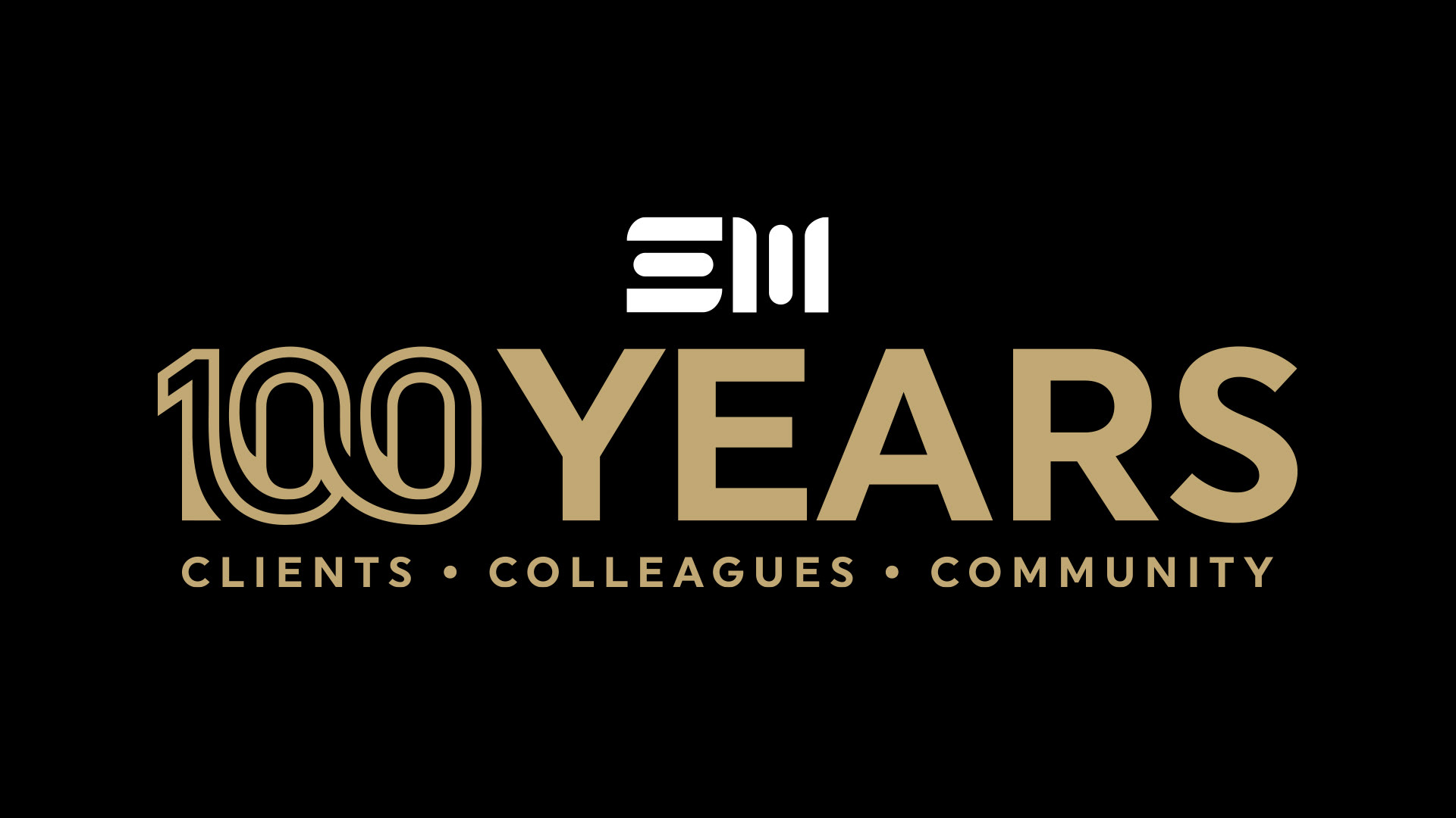
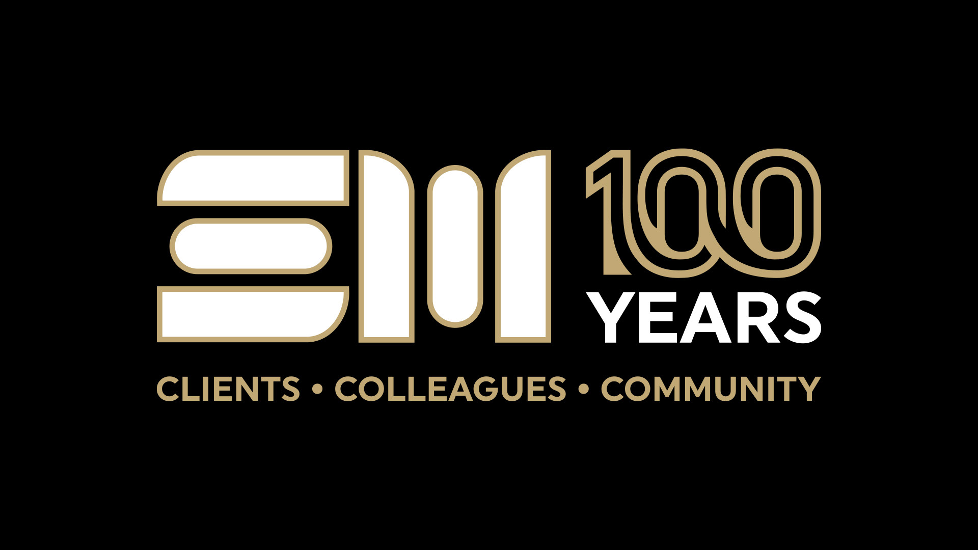
We did a bunch of different layouts of the 100 Years combinations with the logo, but I will just showcase a few.
We decided to use black, gold, and white; a different colour palette from their usual blue, black and silver. We did this to give the year extra significance. It needs to stand out from everything else and be truly special.
The main design element here is the 100. It uses outlines as a tie to the Stark and Marsh SM logo, which has outlines. The font is fairly bold, also inspired by the SM. From there, I wanted to make an original looking 100 icon. It deserved to be special, something much more than just typing out 100. The connected route/road that you see in the numbers is meant to symbolize Stark and Marsh's storied journey to get to this point.
Check out Stark and Marsh's website tribute to their 100th year:
It has some great history.
Stark and Marsh's main office is on Central, just across from Pharmasave in Swift Current. They also have locations in Shaunavon and Assiniboia.
Thanks so much Stark and Marsh, and a huge congratulations!
Stark and Marsh on Facebook: www.facebook.com/StarkMarsh
Stark and Marsh on Instagram: www.instagram.com/starkmarshcpa