I've known Gary Voysey professionally since moving back to Swift Current in 2014. It wasn't until 2019 that Gary, and his wife Carrie, decided to pull the trigger on an updated logo for Swift Current Christian Taekwondo. It's always a pleasure to interact with the Voyseys at any capacity.
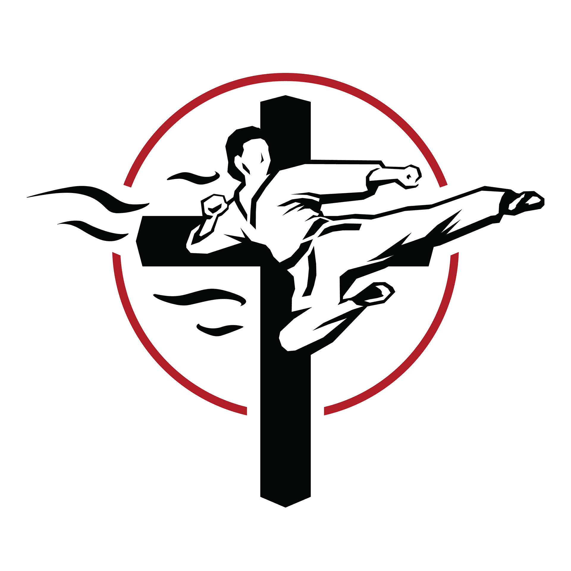
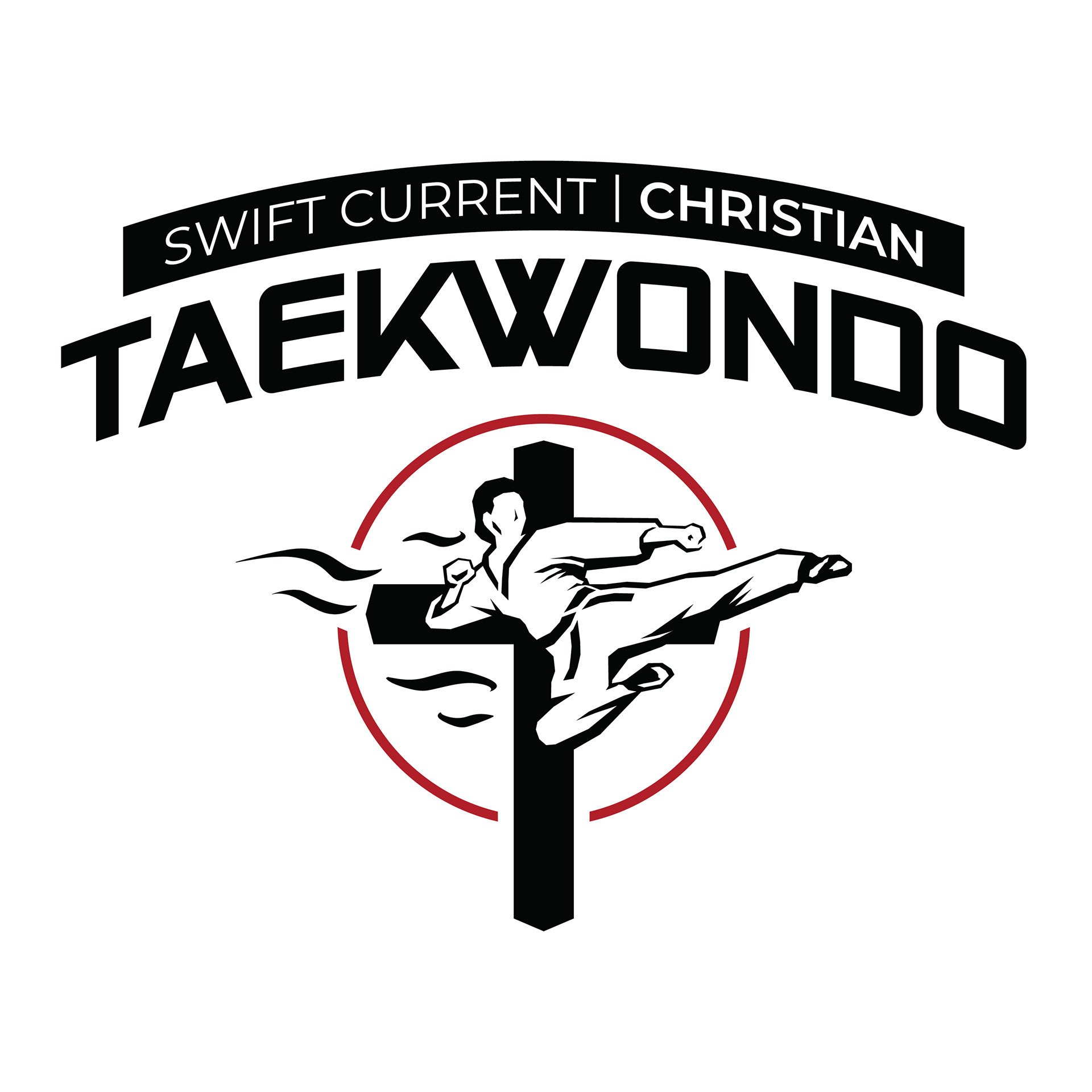
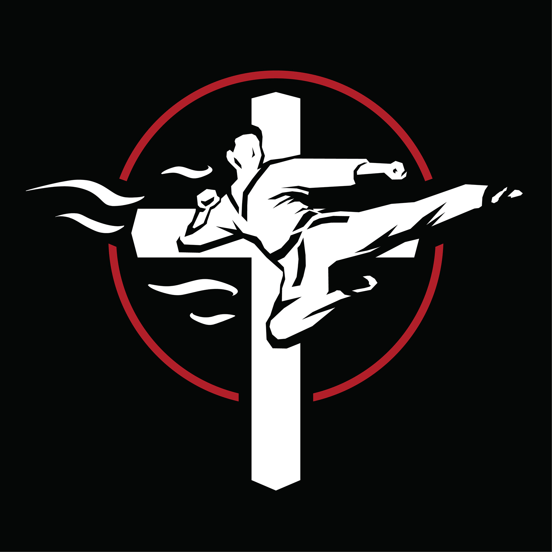
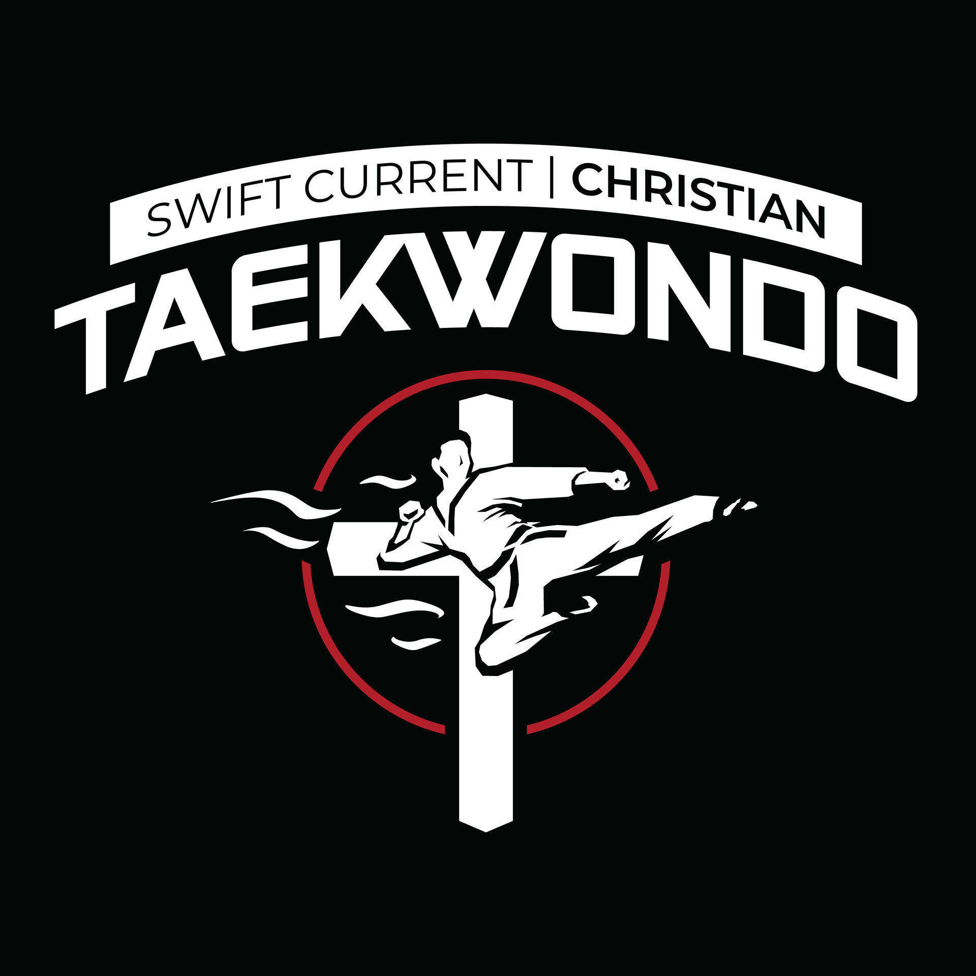
We established what they were looking for fairly quickly over coffee at Urban Ground. A martial artist, a cross, and wind; which would represent action, the South West, and the Spirit. Later on, the circle was added to tie everything together while representing the sun.
I went a more intricate route in the design of the martial artist. Most of my logos aren't as complex, but some are best this way. That is where the bulk of the time was spent designing and refining once the wordmark and layout of the icon was established.
The wind is placed in areas to evenly balance out the left side of the icon with the right side. The leftmost wind is the same height and distance away from the centre as the right foot on the rightmost side. This keeps the logo balanced and the cross centered.
We used their preexisting colour palette, which was ideal as red is the colour most associated with taking action, and is often used in martial arts.
If you are looking for a fun way to get in shape, or are looking to learn some self defense, check out Swift Current Christian Taekwondo: