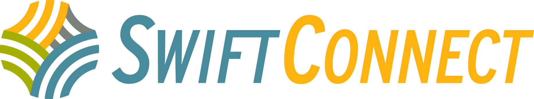
I love Swift Current. I enjoy working for the City when I'm given the opportunity. In 2021, I was selected to design the SwiftConnect logo and wordmark. What an honour :)
SwiftConnect is the City's new online customer portal that links their existing Community Services Online Portal with a new Property Tax & Utilities Online Portal.
Thoughts behind the design:
-Folks need to trust this platform instantly as something official from the City, therefore it'd be in our best interest to use the same font and colours as the Swift Current logo.
-The service should be perceived as quick and easy, or 'fast'; so let's italicize that font and give it some motion.
-Because 'Connect' looks quite a bit like 'Current' when you aren't reading the word, I thought it would be important to make the wordmark two colours. This treatment helps distinguish it from the 'Swift Current' treatment, which is always one colour. The yellow 'Connect' also suggests a bit of playfulness that "Hey, we switched the second word up, see what we did there? ;) "
-The tool is multifaceted and you can do quite a diverse range of things on the site. To represent this, the icon is made up of different pathways suggesting different options and services. It ultimately connects back to itself and continues to go around, as you'll be able to come back to it again and again for different needs. Maybe this week you want to book a time at a swimming pool, and next week you need to pay your utilities. The colours also attest to the diversity of options available.
-The icons lines are designed to subtly recall some time-honored Saskatchewan designs such as the old Saskatchewan wheat bushel logo; while fitting within Swift Current's current brand identity which includes the City logo, the Downtown logo, and others which are all quite simplistic and a bold use of simple lines.
A huge thank you to Michael Boutilier and the other City staff involved in this process for giving me this awesome opportunity.