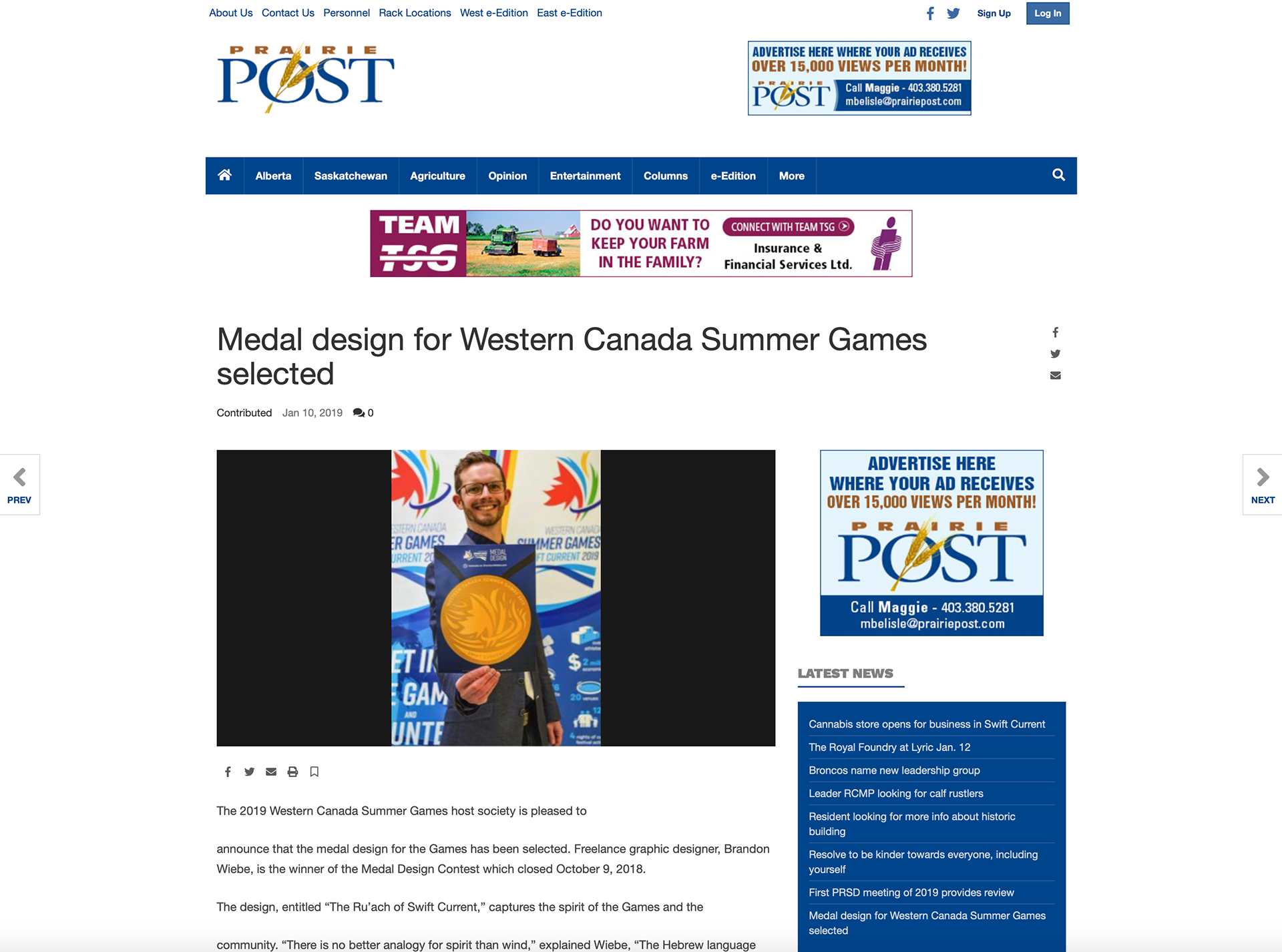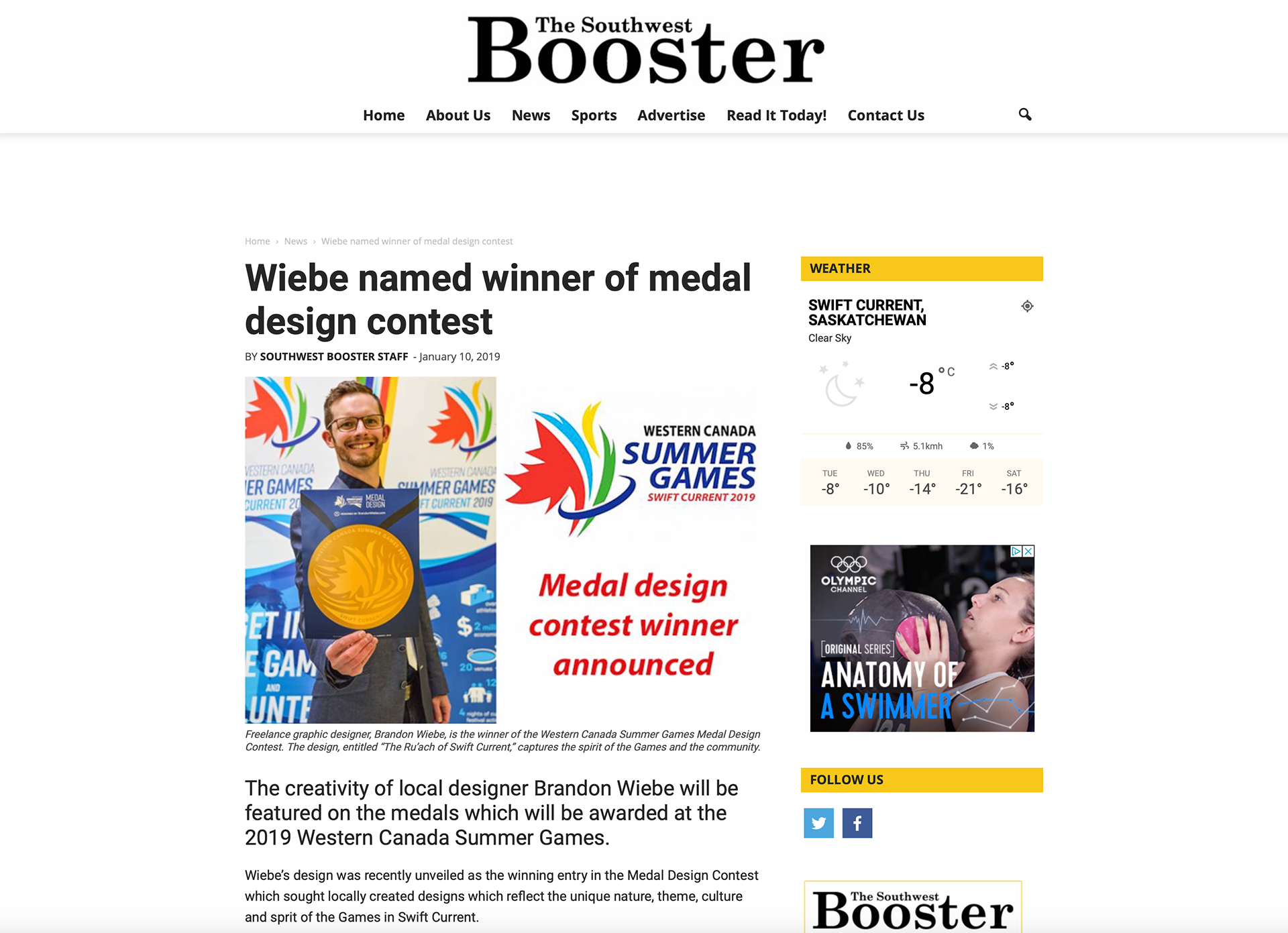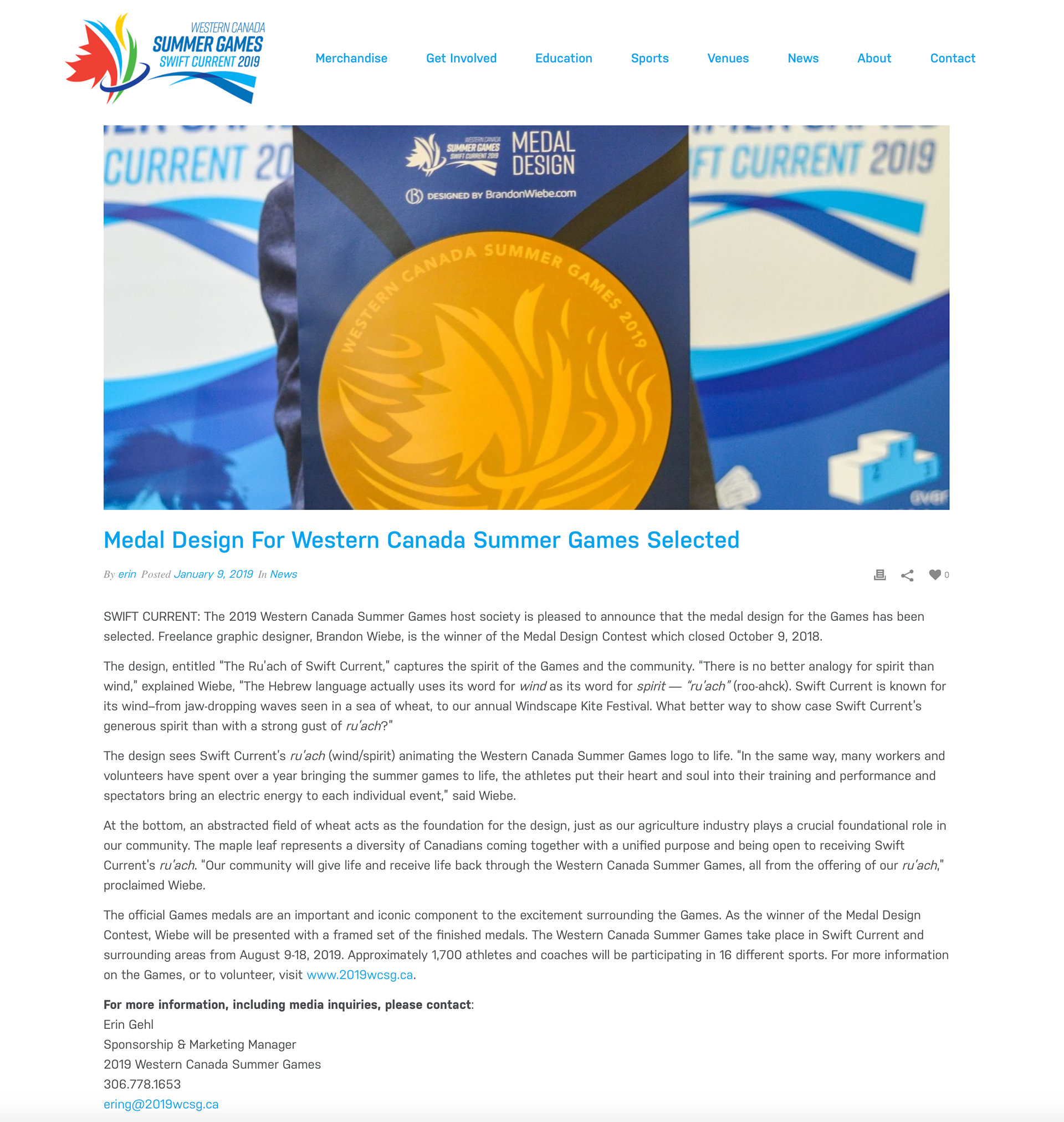
In 2019, the Western Canada Summer Games are being hosted in my hometown of Swift Current, SK. I couldn't believe it when I found out that there was a design contest to design the actual medals that the athletes would win. I've had my designs on billboards, hockey jerseys, pressed into chocolate—but never medals.
At the time of the contest, I had a lot of client work on my plate, and for a few weeks I doubted that I'd be able to get a submission together. Fortunately, one day I had a bit of leeway in my schedule, so I just decided to go for it. The organization wanted a design that tied it into Swift Current, and I couldn't be happier with instructions like those.
The design came together relatively quickly, which isn't uncommon when you are hit with strong inspiration after having a few weeks to stir on a concept. I had been listening to a podcast called "The Bible Project", which is an intelligent podcast that dives into fairly sophisticated Biblical topics. One of the episodes that impacted me most was about breaking down the definition and uses of the word 'spirit' in the Bible. Hebrew words seem to have a lot more to them than English words. Their word 'spirit' is the same word for 'wind', because when they tried to describe what spirit is, the movement of spirit, the best word analogy was wind. Bingo. Swift Current, our large volunteer base, and the efforts of each athlete.
I'll quit babbling here, and let you read the write-up that I sent along with my medal submission (below a couple images). The design is quite rich in meaning, and the press release didn't hit all the points.
I am extremely grateful to have had my design chosen.

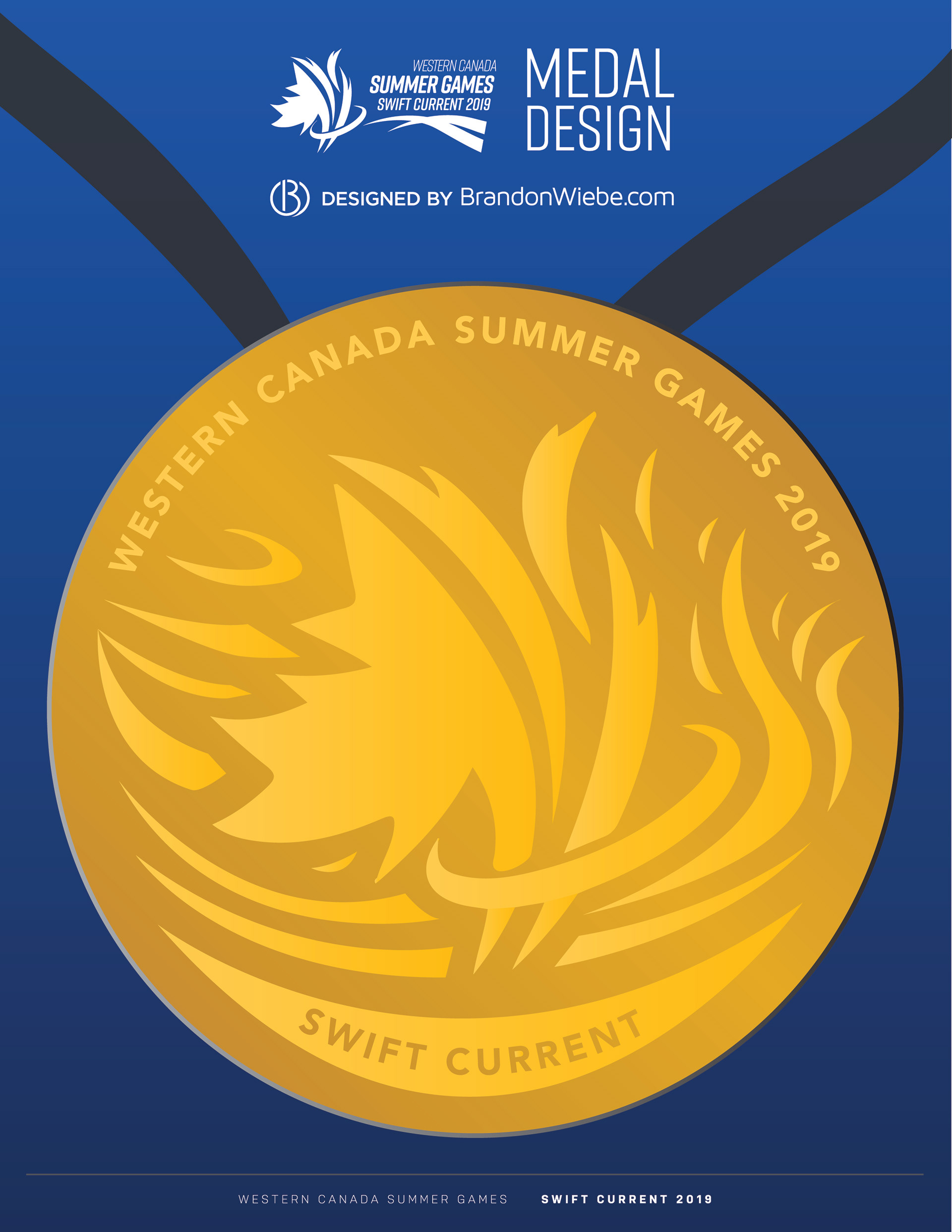
The Ru’ach of Swift Current
Medal Design Entry by Brandon Wiebe
There is no better analogy for spirit than wind. The Hebrew language actually uses its word for windas its word for spirit— “ru’ach”(roo-ahck). Swift Current is known for its wind, from jaw-dropping waves seen in a sea of wheat, to our annual Windscape Kite Festival. What better way to show case Swift Current’s generous spirit than with a strong gust of ru’ach.
In the medal design, we see Swift Current’s ru’ach(wind/spirit) animating the Western Canada Summer Games leaf logo to life. In the same way, many workers and volunteers have spent over a year bringing the summer games to life, the athletes put their heart and soul into their training and performance, and spectators bring an electric energy to each individual event.
On the left side, the wind comes in unison, representing everyone’s efforts blowing the same direction, bringing the games to life, and athletes coming from across Western Canada to Swift Current to compete. To the right of the leaf, the wind disperses in different directions, changing in celebration. Just as each individual involved will take away a unique perspective and experience from the games.
Diversity and victory are not lost in the wind. Many different shapes and sizes of lines come together to represent our ru’ach. When we all come together in collaboration, we see a fire-like and victorious celebration.
At the bottom, an abstracted field of wheat acts as the foundation for the design, just as our agriculture industry plays a crucial foundational role in our community.
The maple leaf represents a diversity of Canadians coming together with a unified purpose and being open to receiving Swift Current’s ru’ach. Our community will give life and receive life back through the Western Canada Summer Games, all from the offering of our ru’ach.
Western Canada Summer Games article link:
SW Booster article link:
Prairie Post article link: